“A dream come true:” YCP Grad Connects With Orioles Broadcaster Through Art
Recent Graphic Design graduate, Maddie Petry ‘25, is a huge Baltimore Orioles fan, so when she was given a “Mashup” letterpress assignment in Troy Patterson’s Spring 2025 semester course, she knew she wanted to use a baseball theme.
“Reflecting back on the Baltimore Orioles 2024 season, my most memorable moment was Anthony Santander’s go-ahead grand slam against the Houston Astros on August 23rd,” said Petry. “The on-air call by Orioles broadcaster Kevin Brown, that started with an enthusiastic, ‘Swing and a fly ball,’ has stayed in the back of my mind since.”
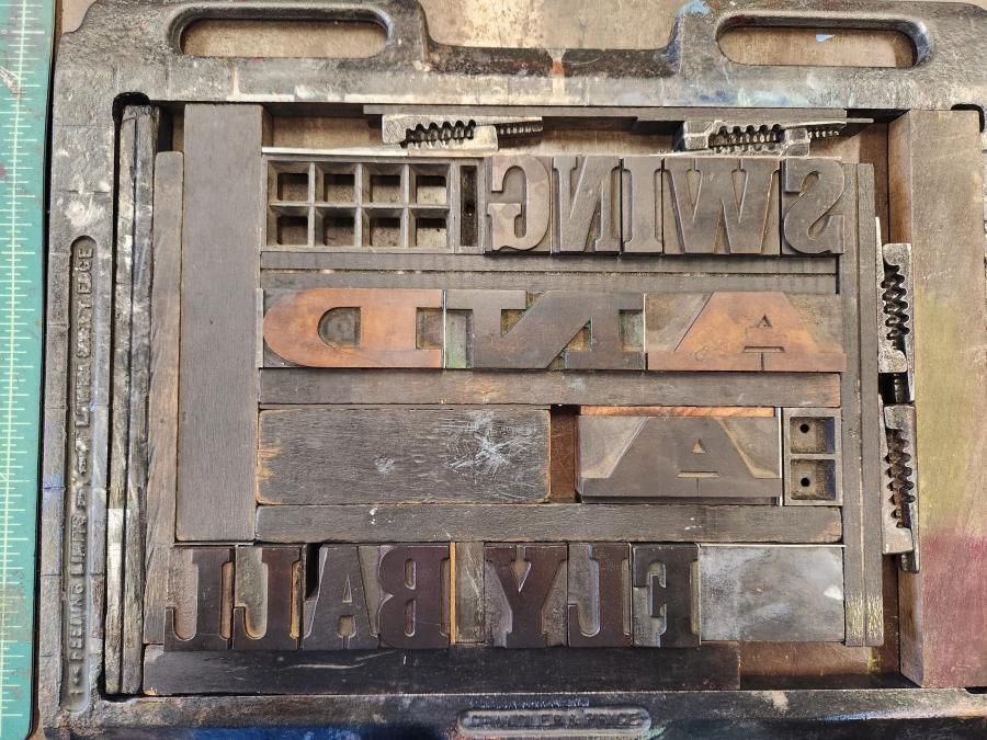
Petry’s letterpress print piece, titled Swing and a Fly Ball, emphasizes the iconic moment she recalls so clearly and incorporates related imagery to tell a story.
Hands-On Graphic Design
In an age where everything seems intangible, revisiting tactile techniques can create a deeper connection with design concepts and practices. Assistant Professor of Graphic Design and Letterpress, Troy Patterson, uses the “Mashup” project to challenge students to do just that. By combining vintage letterpress “cuts” (printing blocks) with hand-set typography, students create a design that communicates meaning—using letterpress machines, inks, and paper.
Patterson explained, “Students experiment with overprinting—layering one ink color over another—to produce blended colors and unexpected effects. Through this process, designers explore how hierarchy, color, composition, and negative space work together to shape communication and creative possibilities.”
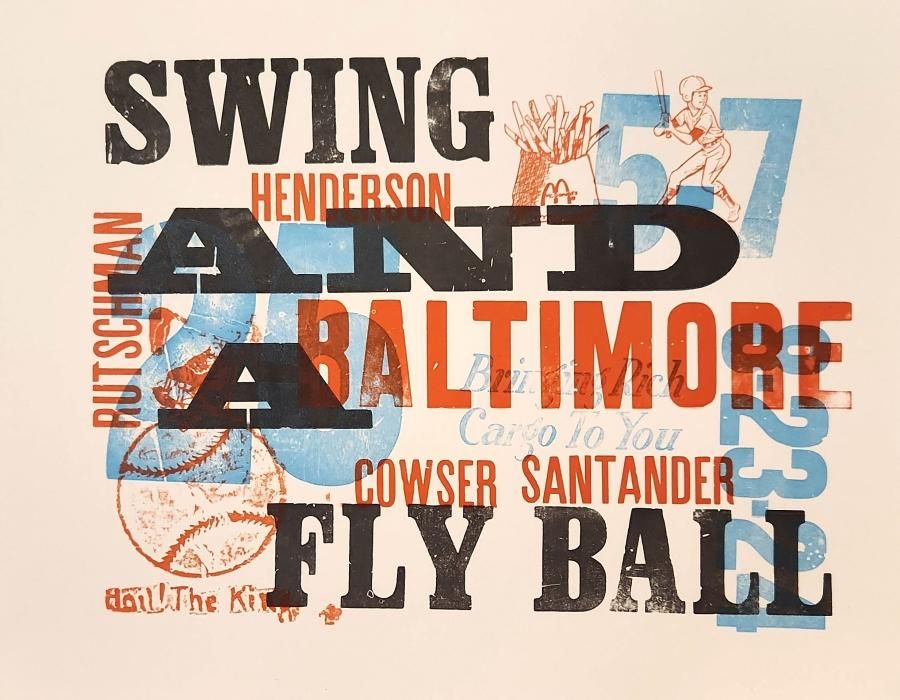
Petry’s design emphasizes her main concept, Baltimore’s “Swing and a Fly Ball,” and layers:
- The names of the players that scored - Cowser, Henderson, Rutschman, and Santander
- Game date - 8/23/24
- Final score - 5-7
- Santander’s number - 25
- Baseball cuts
- A cut of the phrase “bringing rich cargo to you” to reference Santander’s consistency in hitting home runs
- A cut of McDonald’s french fries as a nod to Santander’s nickname “Tony Taters”
“I composed the print creating four lockups of my type and cuts—one for each layer, with the exception of the orange layer, in which I made two lockups for—and printed them on one of the large, motorized presses in the studio with the help of Troy,” Petry said. “Seeing the final print at the end was rewarding as it came to life even better than I had originally envisioned.”
Reaching a National Audience
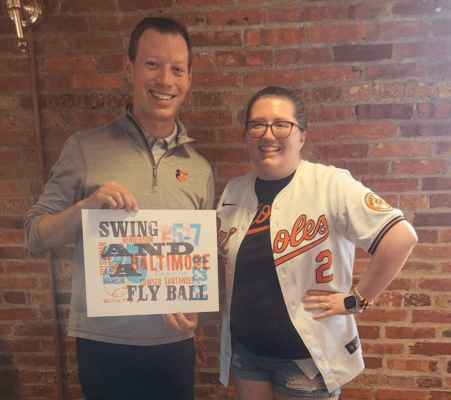
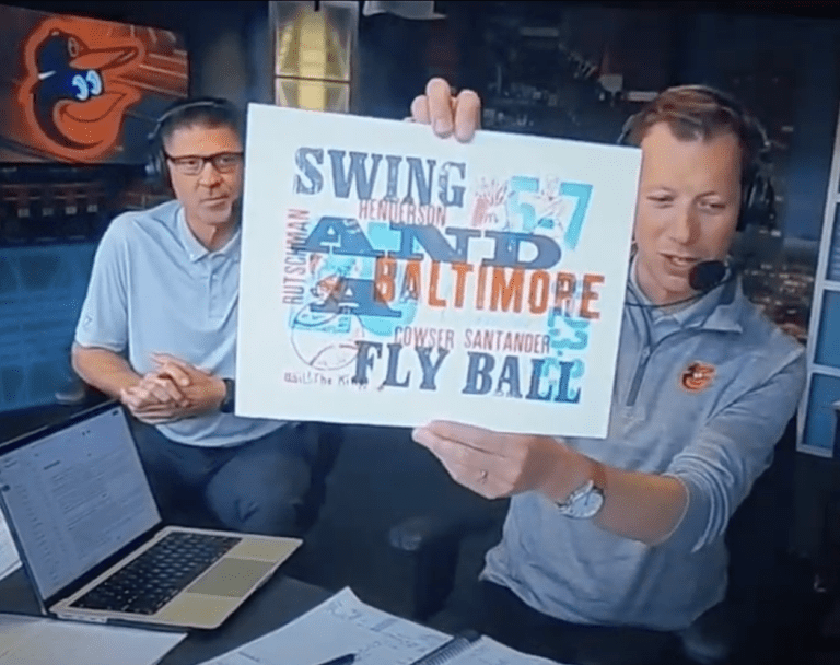
At the end of August, Petry had the opportunity to meet with members of the Orioles broadcast team. She brought one of her prints along, hoping to give it to Kevin Brown. “When he made it to my table, I gave him the print and he seemed really interested,” Petry said. “He asked questions about what each of the items represented on the print.”
She never expected him to show her print on the broadcast that night, but during the bottom of the fourth inning, Kevin Brown held the paper up for the camera and explained some of the meaning behind it. This was a moving experience for Petry. “I started to cry as I watched the video because I have loved the Orioles my entire life and dream of working as a graphic designer for them,” she said. “Kevin Brown is my favorite broadcaster, so this was a dream come true for me, in a way.”
The Power of Slowing Down
Sometimes the best way to envision the future is to learn about the past. In today’s digital age, letterpress is a valuable teaching tool in graphic design education. YCP’s letterpress studio uses century-old equipment and techniques to teach students:
- typography,
- hierarchy,
- spacing,
- and composition.
The slow, hands-on process of letterpress links students to the history of graphic design, while sharpening their attention to detail and reinforcing design as both a craft and a discipline.
“By combining traditional letterpress techniques with modern digital tools, students graduate with a stronger foundation, a richer creative perspective, and a unique advantage in the 21st-century design industry,” said Patterson. “Letterpress reminds students that design is rooted in materiality, history, and precision, helping them carry these lessons forward into digital practice with a stronger sensitivity to type, layout, and visual impact.”
Creating Connection Through Design
When Petry chose to take a personal approach to what might’ve seemed like a strictly technical assignment, she opened the door for a larger opportunity. The thought and passion she put into her print clearly came across in her interaction with Brown and expressed her deep knowledge of the game in a visual and unexpected way.
Patterson shared, “Her project shows how this assignment helps students develop technical skills while also sharing personal and meaningful stories. I encourage every student to see this project as a chance to combine craft, design principles, and personal narrative into a unique piece of work.”
To learn more about York College’s letterpress studio, read our previous interview with Patterson, where he discusses the advantages of physical making in art and design.